[틱톡 따라하기] Pie Chart Infographics - Excel Tips and Tricks
https://vt.tiktok.com/ZSDRUsyPu/
TikTok · Xybernetics247 님
좋아요 1218개, 댓글 10개가 있습니다. "Pie Chart Infographics - Excel Tips and Tricks Learn how to create pie chart infographics in Excel. Here the steps outlining my video. Insert Doughnut Chart 1) Highlight Activities and Hours column 2) Inser
www.tiktok.com
Pie Chart Infographics - Excel Tips and Tricks
Learn how to create pie chart infographics in Excel.
🔗 지금 바로 사용해보세요!
클릭 한 번으로 바로 접속해서 복사하여 사용하실 수 있습니다
Issue : 엑셀만큼 디자인을 활용하는 것이 쉽지 않네요.. 스프레드시트를 사용하는 데에 있어서 제약이 되는 점이겠군요 ㅠㅠ
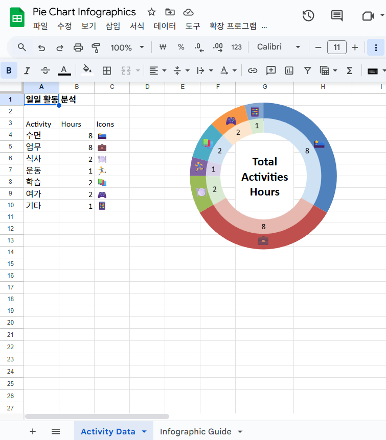
Insert Doughnut Chart
1) Highlight Activities and Hours column
2) Insert ~ Doughnut
3) Delete header and legend
4) Resize and reposition
1) Right-click on the doughnut ~ Select Data
2) Add
3) Select Hours column (without header)
4) Press Enter twice
5) Edit
6) Select Activities column (without header)
7) OK
8) OK
9) OK
Change doughnut hole size
1) Select outer doughnut
2) Ctrl+1
3) Doughnut hole size = 50%
Change inside doughnut color
1) Select inside doughnutrubix cube magnetic
2) Ctrl+1
3) Fill & Line
4) Transparancy to 40% for all inside doughnut
Add Data labels
1) Select inside doughnut
2) Add data label
3) Select data label
4) Category = Custom
Format = ##0 " hrs"
Add
5) Select outside doughnut
6) Add data label
7) Select data label
8) Value from cell
9) Select Icon column
10) OK
11) Category Name
12) Separator New Line
doughnut chart excel,infographic,doughnut graph,
Pie Chart Infographics,Doughnut Pie Chart in Excel - Infographic,How do I make an Excel pie chart look professional?,How can I make my pie chart more attractive?,How to make Excel graphs more attractive?